

Vodafone Business
Page under construction
Client: Vodafone Business
Duration: 3 months
Role: UX/UI
Focus point User journey, Information architecture, wireframes, prototypes, atomic design system, modular design system
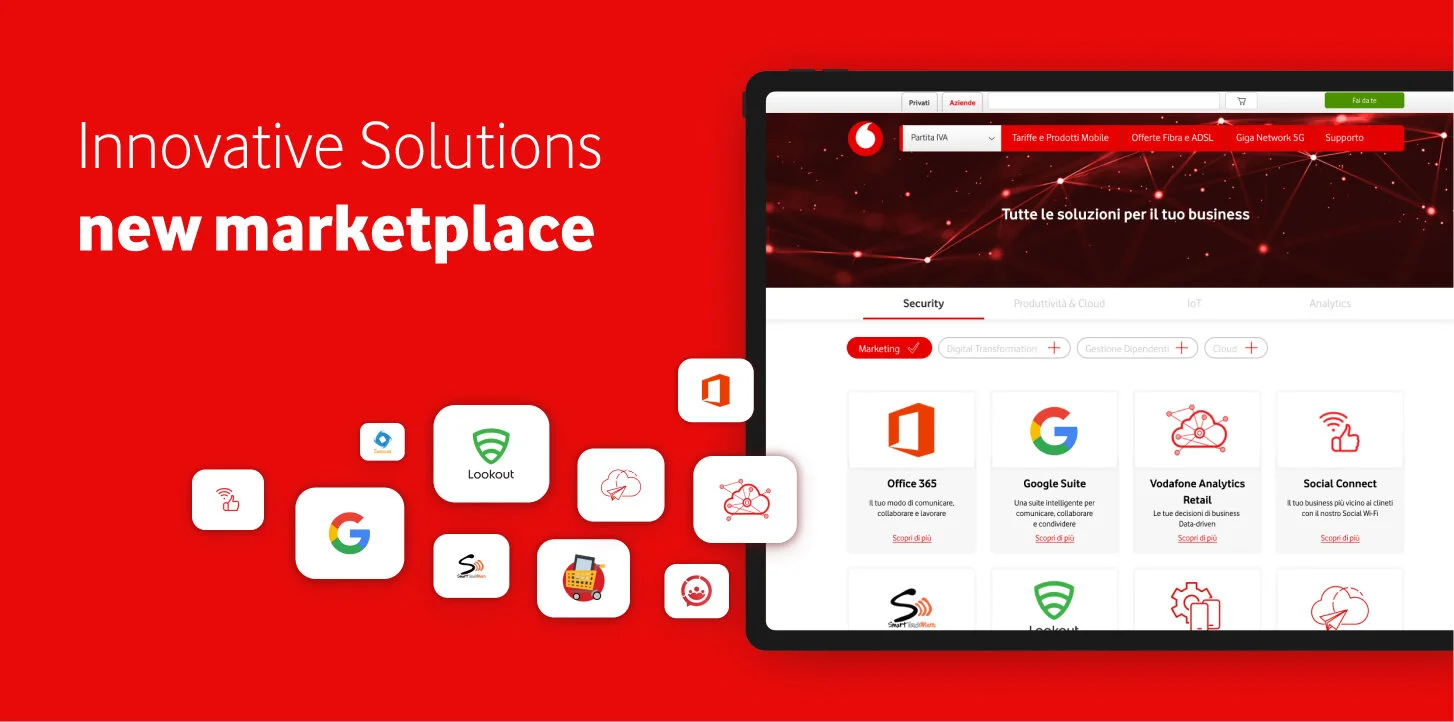
Scenario Vodafone Business has a portfolio of services and products, called Innovative Solutions, to pair with giga and internet plans. The old marketplace (bad UI, unorganized, frustrating cex and user journey) was to rethink and redesign
Need A new, clear, organized, easy to manage, and easy to reach marketplace. Each Solution demanded a dedicated page, with the possibility to directly purchase it and/or to make an appointment to further discuss it with the managers.
How New marketplace design, IA of all existing solutions, template modular page.
Added value On each page, we decided to incorporate a lead generation section that the Innovative Solution team can use for the adv campaigns they manage with the CMS we designed for them.
Something you can’t miss
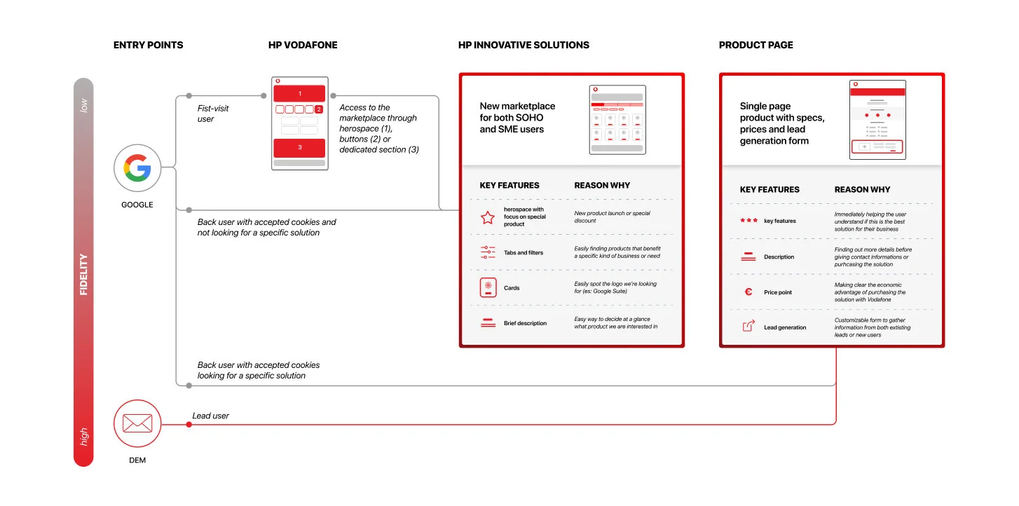
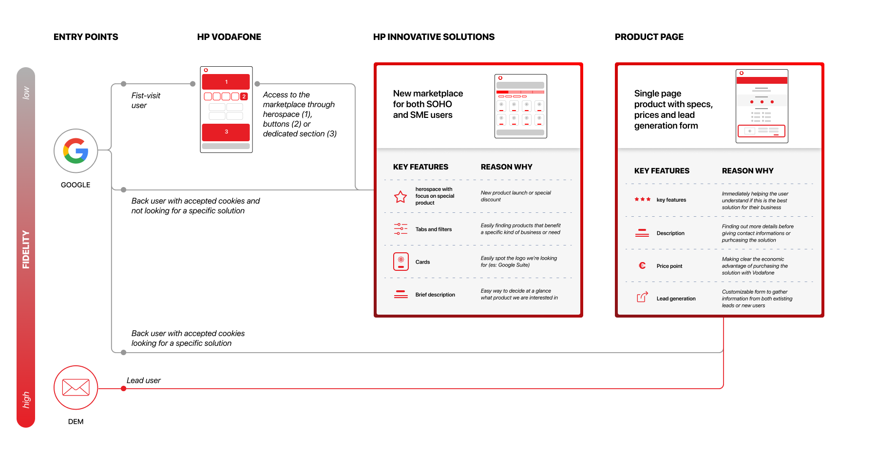
New user journey
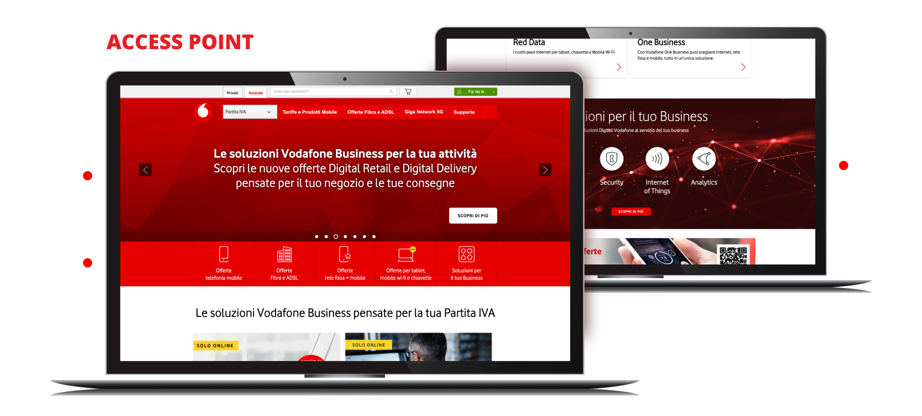
Pain point: Accessibility to the marketplace
The direct link to the old marketplace had its own domain, and most pages were just used as adv landing pages and not linked to Vodafone homepage or anywhere on the website.
Solution: revised user journey
Bringing first-visit users on the Vodafone Business homepage, now presenting various access points to the marketplace homepage. An alternative route for second-visit users or profiled ones were designed in order to make them land directly on specific product pages.
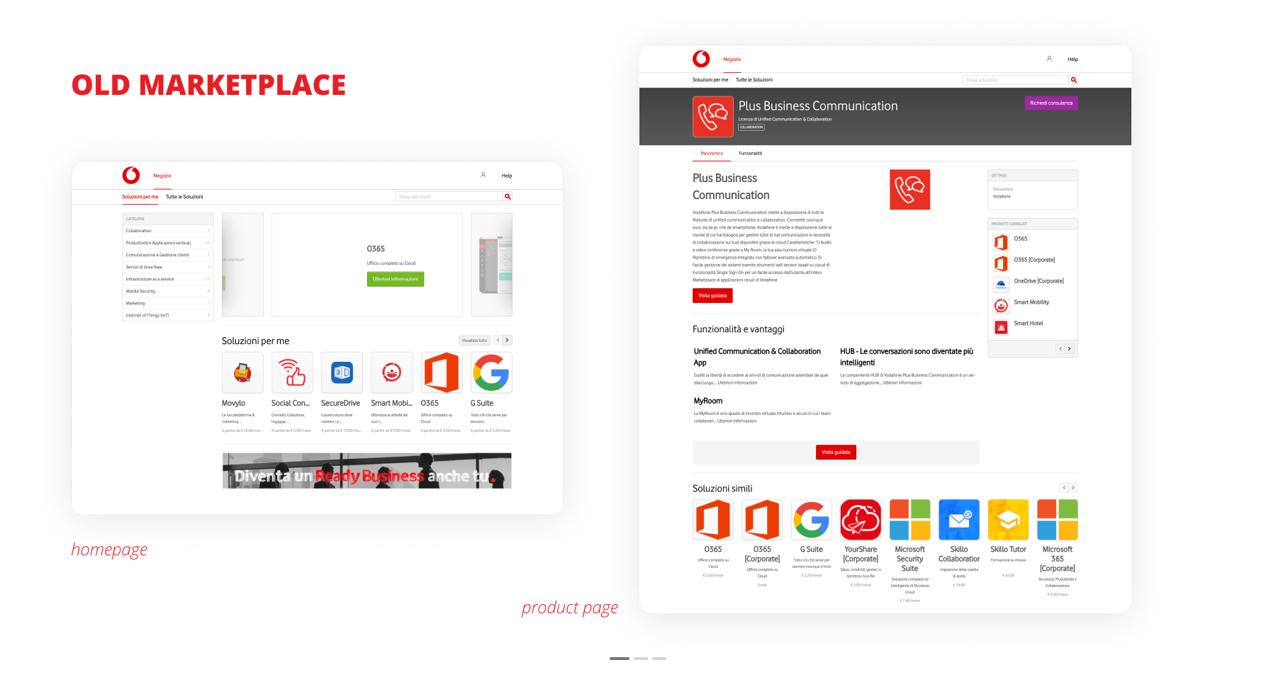
Kondo-ing the old marketplace
IA & ux writing
The most important task I carried out was navigating the old marketplace and meeting with the team trying to define:
how many products were online and which ones of them were still available
how many features and price point each solution had
categorizing and grouping them
the most recurring features such as technical specifications, videos, images, etc
desired CTA on the pages (buy or fix an appointment with managers)
Page Scan
Pain point: Difficulties for the user in finding the right product
The visual confusion created by colors, logos, long paragraphs on the old pages made it really difficult to scan and detect a single product
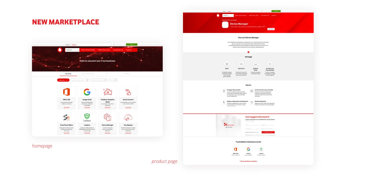
Solution: IA and good old tabs and filters
As simple and effective as tabs and filters are, together with the Solutions team we were able to find 4 main categories, the more extensive of which we enriched with tags that help the user narrow down the research.
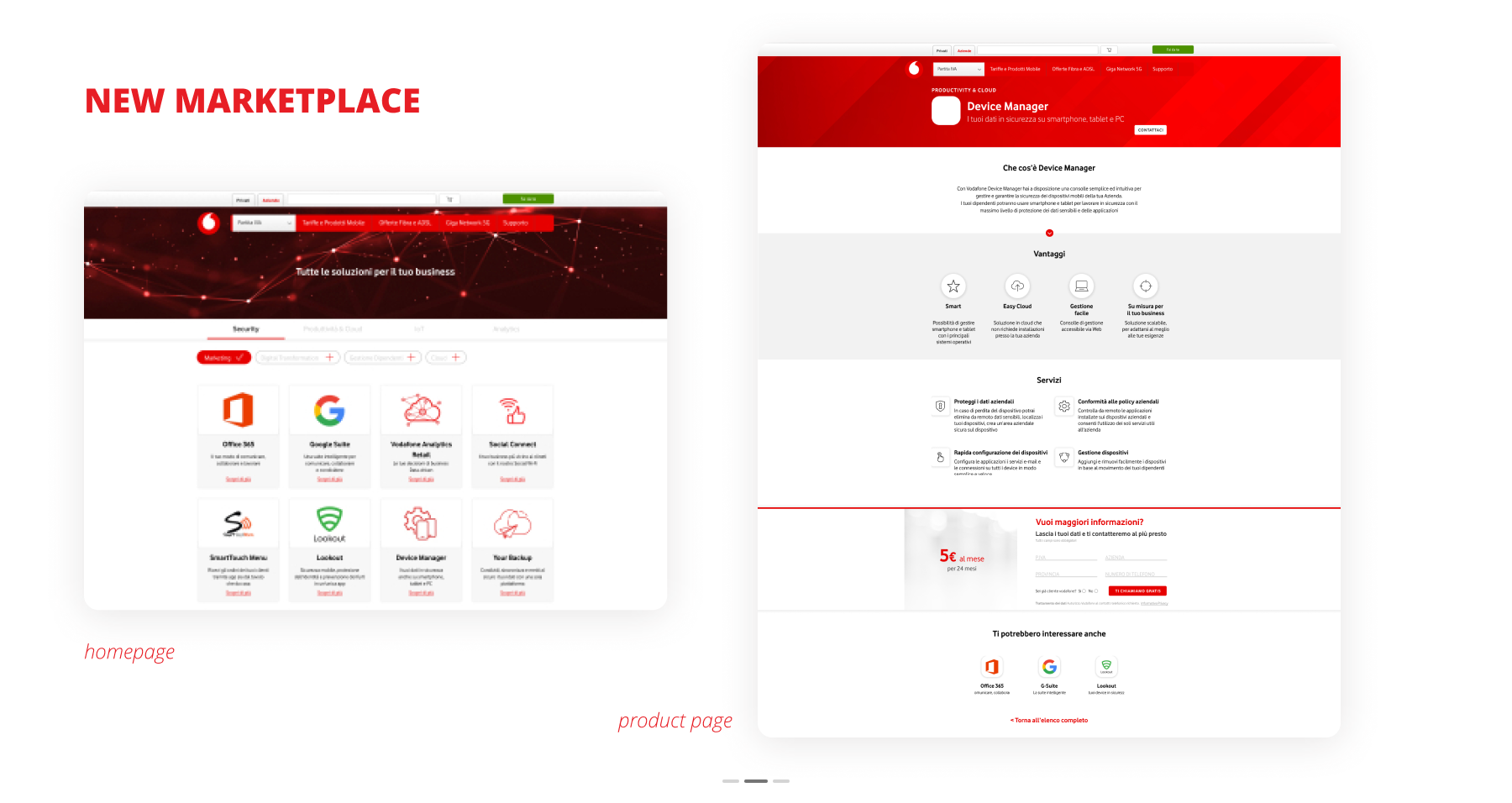
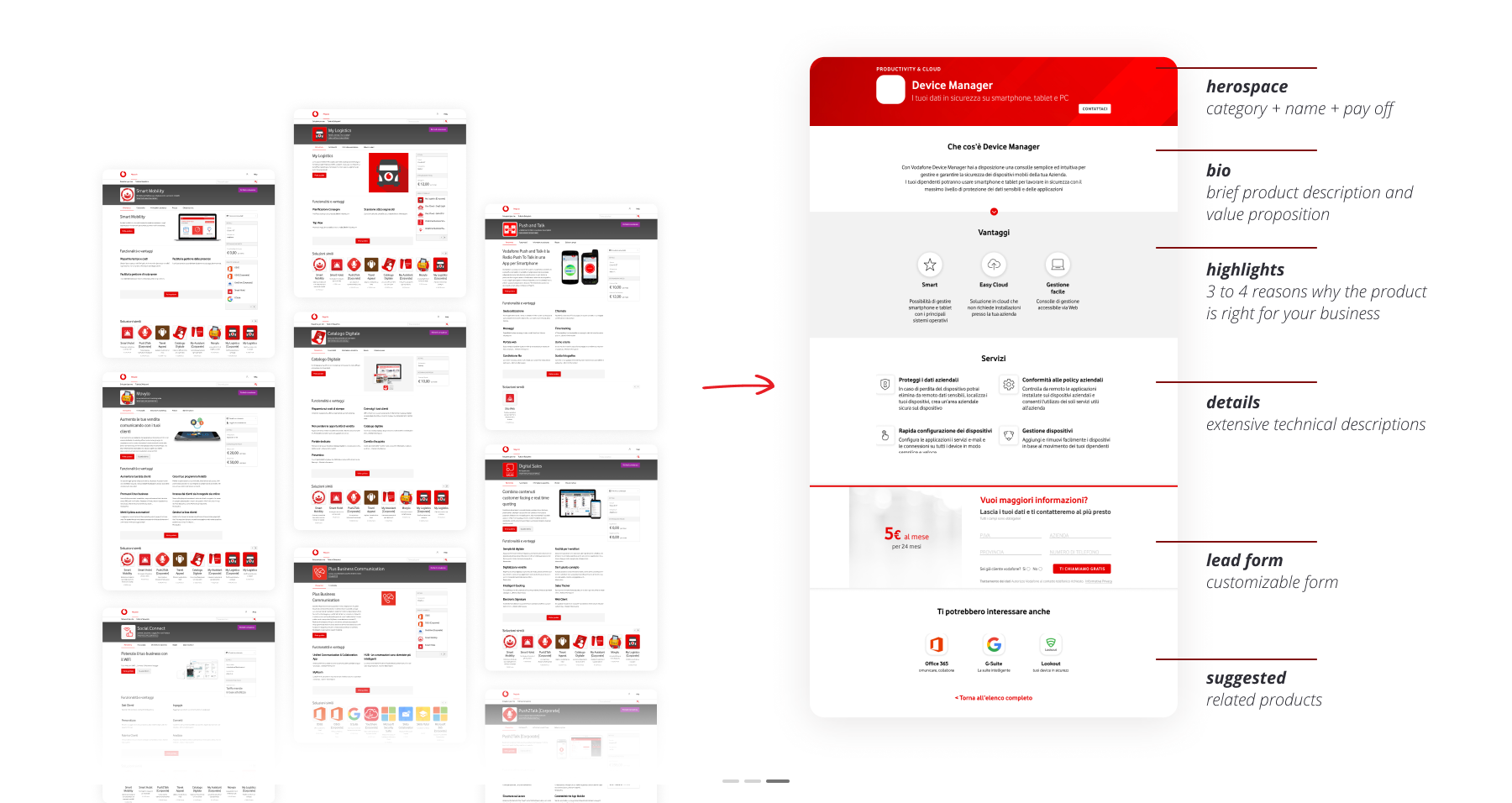
Products Features
Pain point: too much text, unclear business potential and purpose of each product
The most time-consuming and challenging job was trying to find a content common pattern among the Solutions I could have used to create the modular system needed. The pre-existing pages were cluttered and overwhelming: most of the products had very long descriptive paragraphs with no visual aids that could help users identify important features.
Solution: UX writing and visual aids
I re-wrote each product description trying to condense into max 2-3 sentences all the features a business user would have been potentially interested in when browsing that specific page. I then identified 2 to 4 added values paired with Vodafone design system icons and a brief, catchy, self-explanatory description.
Longer paragraphs are now bottom-paged and dedicated to actual technical features that necessarily require an in-depth explanation ans at the same time their position prevents the user from being overwhelmed with too much information. I also designed different layouts and modules that could meet different product features, such as carousels, videos, and so on.
DIY, almost
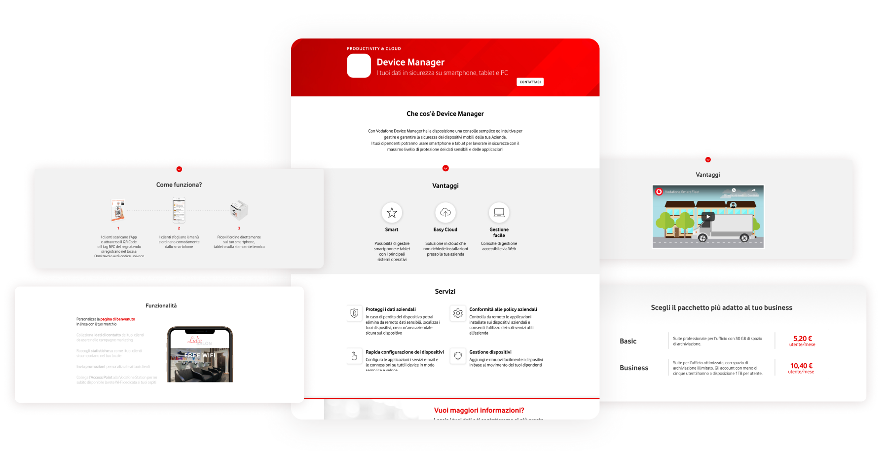
Template page and modular system
Once the content and the sections were defined, I then designed each section, foreseeing different layouts that can be used or discharged based on what the product features are.
Especially the price point and package sections were quite complicated to deal with since each product presented many different elements to combine, for example, Office365 or Google Suite.
Once the system was set up, the team managers were instructed on how to autonomously create new content for products they would have subsequently added to the marketplace.
You get a newsletter, and you get a newsletter, everybody get a newsletter.
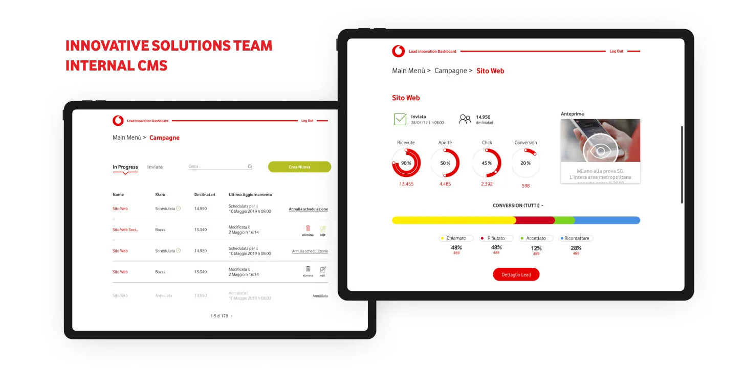
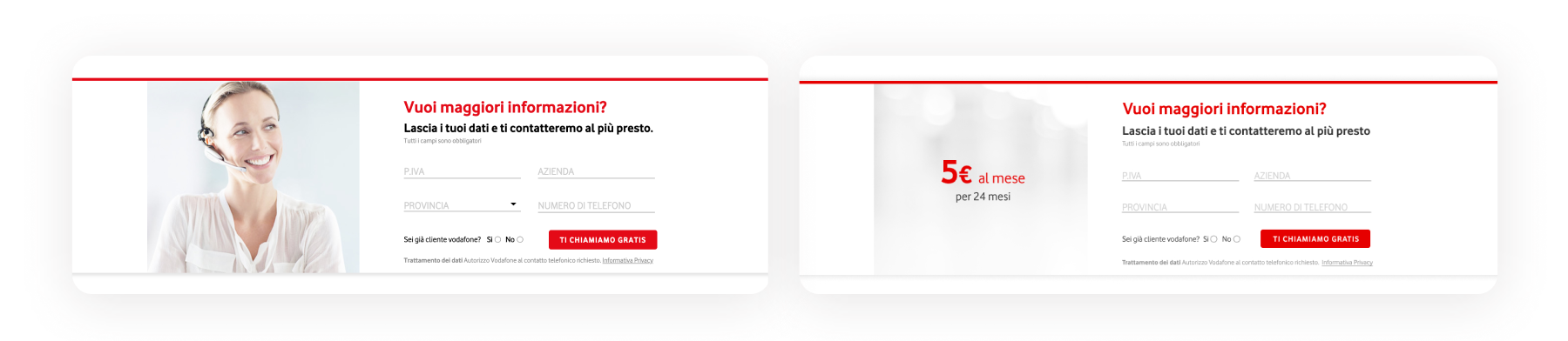
Lead generation
Each product page has been integrated with a lead generation form, directly connected to the CMS the team uses to create and manage their campaigns and all the leads collected. The form is flexible and customizable when placed on cloned pages used for adv purposes.
Newsletters and adv analytics
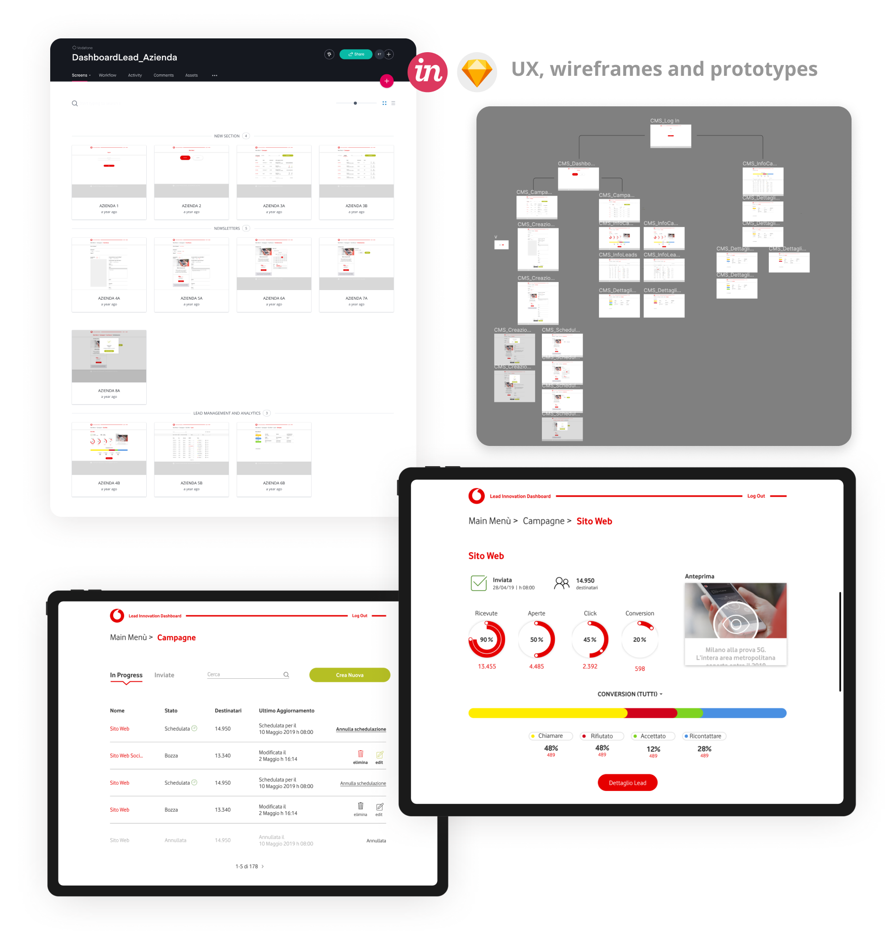
Custom CMS design
A side project we designed for the Innovative Solutions team was a custom CMS, meant to allow all the managers to autonomously create, preview, modify, plan, schedule, send campaigns and collect analytics. A Vodafone Mailchimp, if you will. The tool let you log in both as a Vodafone manager, to manage campaigns and view analytics, or as a vendor to update lead status.
Conclusions
The marketplace project was my first UX solo. It had been difficult at first mainly because I had to confront many different managers and departments. Coordinating with the Solutions team has been challenging as well and it has not been easy to make sure they actually perceived both the new system and the value of essential content as a real value. Eventually, they trusted me and once the concept was defined I received great feedbacks, finding myself collaborating smoothly with each one of them, and months after the launch they were extremely happy with the efficacy of the pages and in particular with the lead generation system.
NB The marketplace homepage has changed a little since we first launched it in July 2019, as from late 2020 Vodafone introduced a more illustrated UI.
Would have been nice to… adopt illustration earlier because I find them much more efficient in communicating broader concept such as "smart work" than simple flat icons
It has been nice to… be on my own and deep dive into the UX side of it! Gimme more stuff to tidy up and I’ll be happier than a kitty in a box.