Carrefour Italia
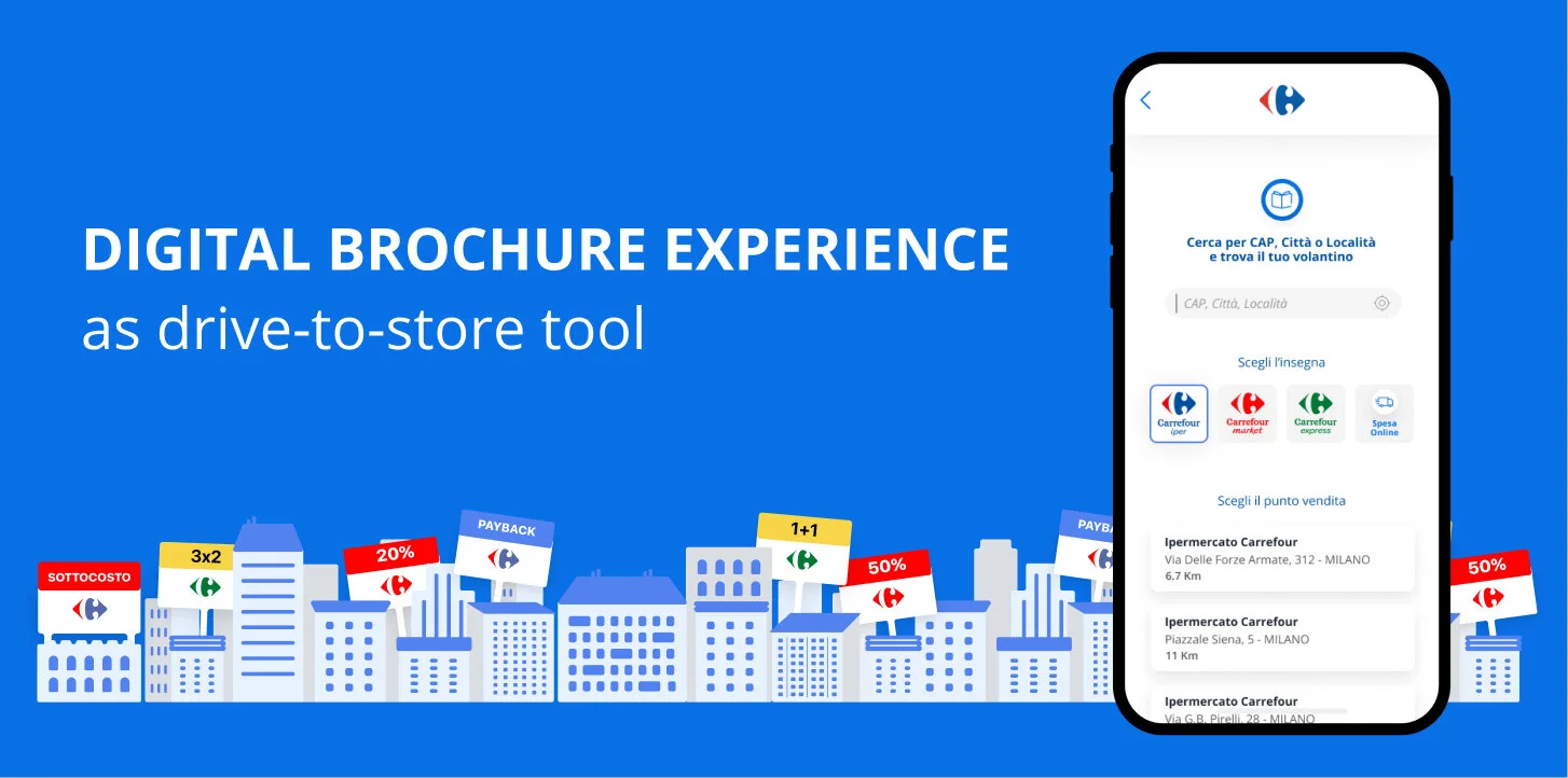
Digital brochures experience
as drive-to-store tool
Client: Carrefour Italia
Duration: 6 months
Role: UX/UI
Focus point User journey, benchmark, wireframes, prototypes, modular design system.
Scenario Young consumers aren’t considering the opportunities offered on paper brochures - printed to promote special discounts and usually handed out in front of a store or received in the mail. As a result they refrain from taking advantage of geolocalized promotions (local), therefore limiting theirs purchases to online promotions only (national).
Need Increasing store walk-in traffic through online engagement
.
How Crafting a brand new digital experience that makes it possible for anybody to geolocalize and to see what promos are available in the stores nearest to them, and their duration.
Added value Providing users with the possibility to easily view all offers; creating a sharable/printable lists of desired goods.
Initial explorations & research
Benchmark and user journey
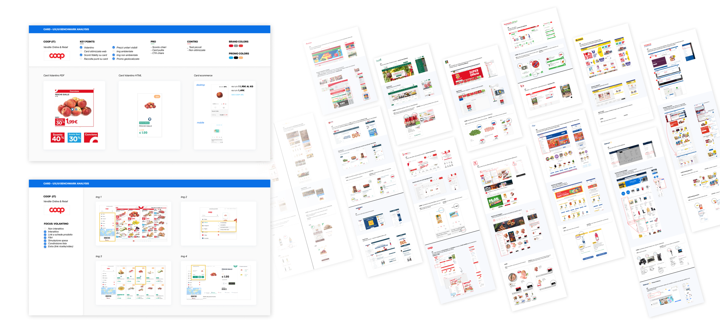
I started by analyzing all major European large scale retail players (GDO) - with a few overseas exceptions - that have both online promotions and local brochures, studying their user journeys, web accessibility, color codes, product cards UI, pdf brochures and special features. The main takeaways from the research were:
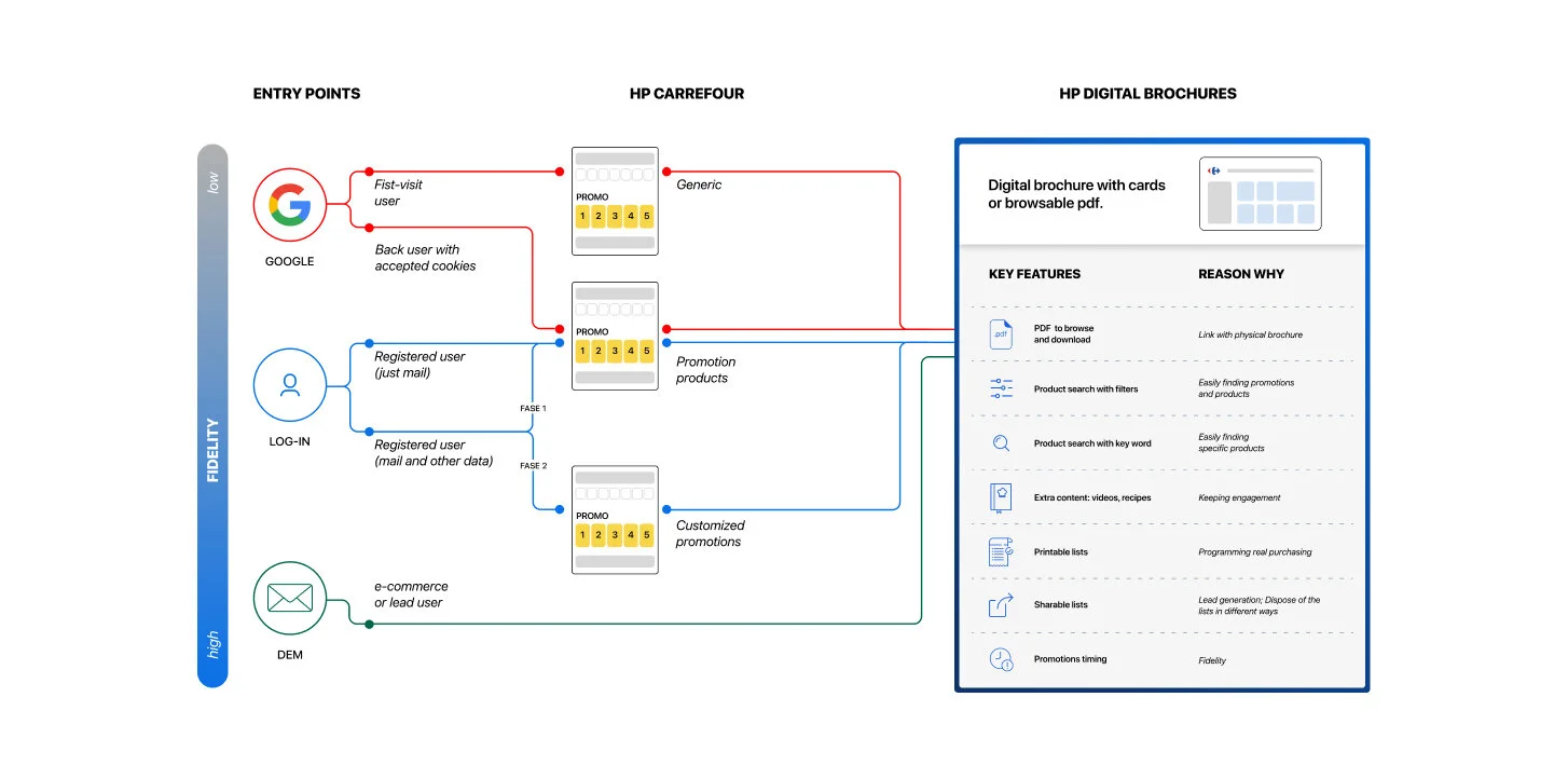
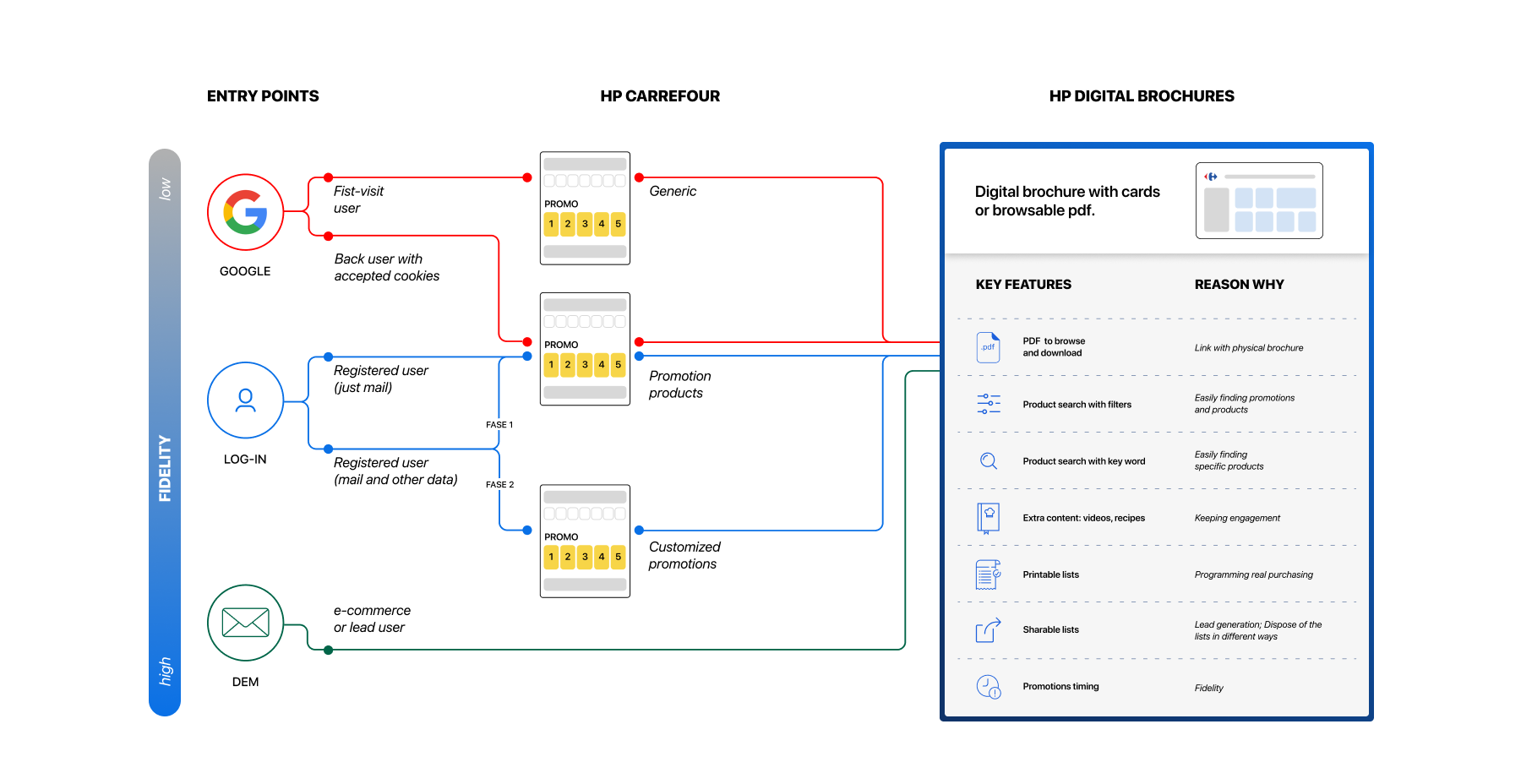
- User Journey Most brands have a company website with a brochures section and then the e-commerce under another domain, while Carrefour is headed in the opposite direction: implementing multiple access points to the brochures in the homepage and throughout the website
- Brochures fruition Only 2 out of 14 brands use a digitalized card grid of products instead of online pdf
Integrated experience
Wireframes, content, pain points
Wireframes and prototyping
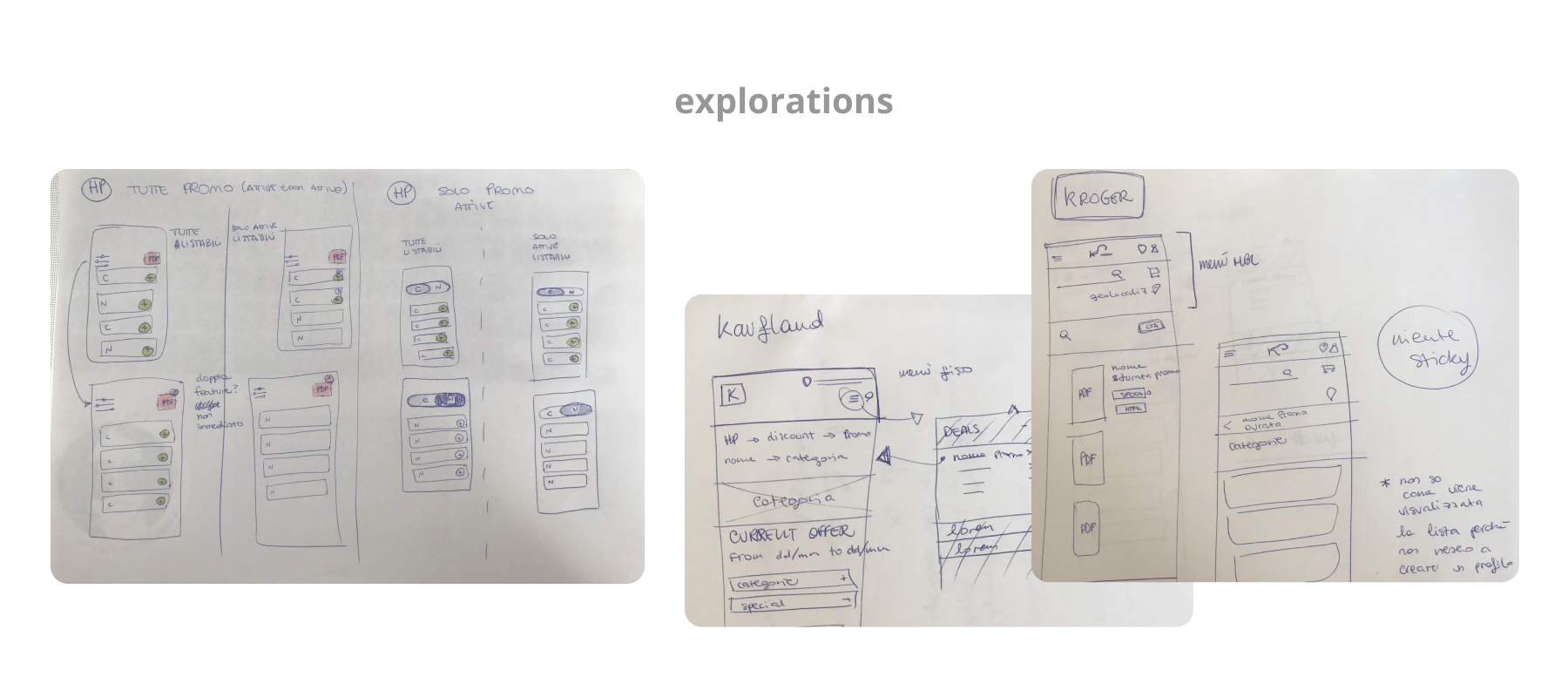
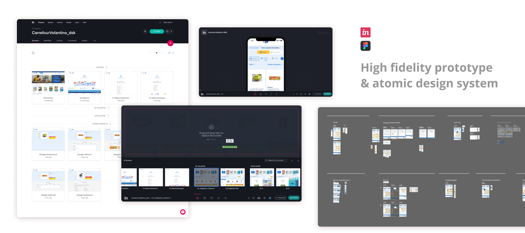
I proceeded with wireframing layouts, exploring possible solutions and then, when satisfied with the outcomes, I created a prototype to present to stakeholders.
Entry points
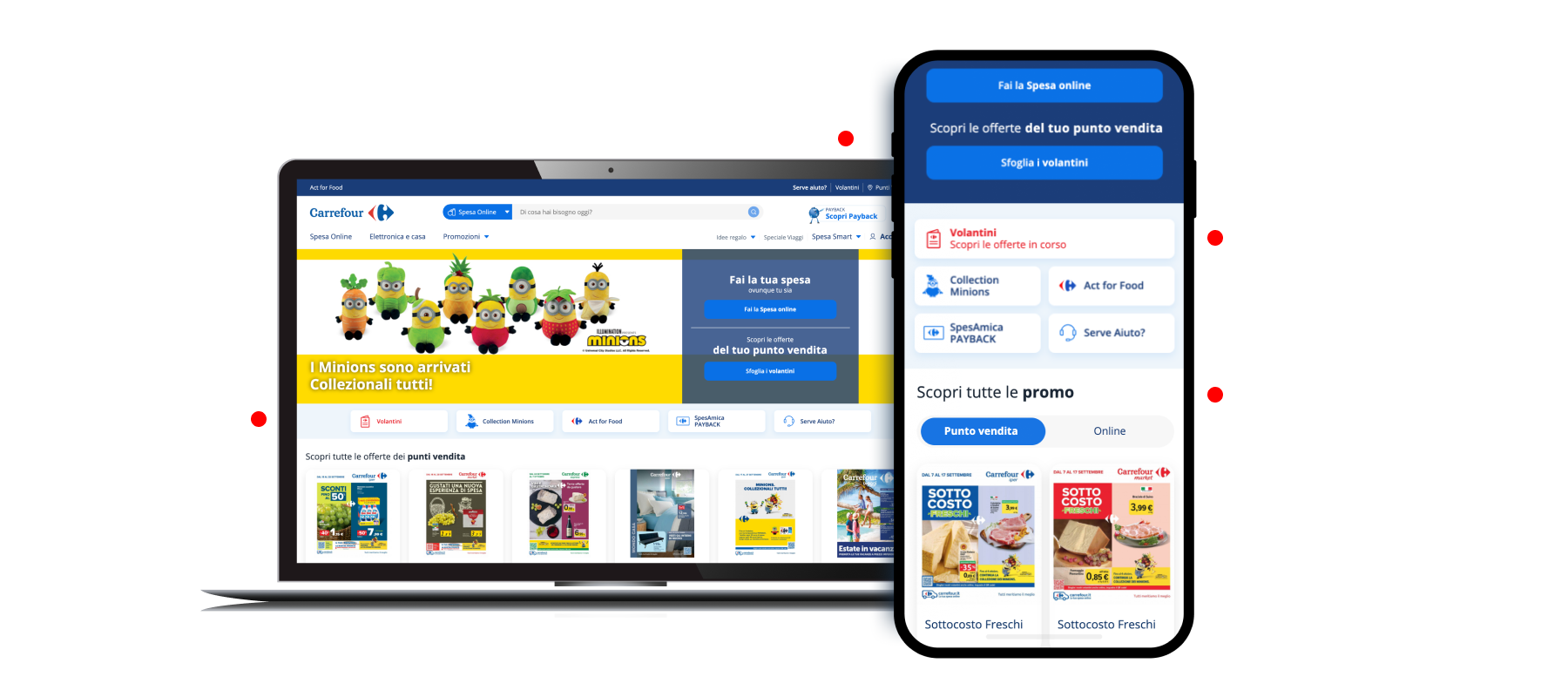
Since both the e-commerce and the digital brochures are accessible through the main website, the user journey starts by localizing the possible access point on the homepage: multiple ways to access the brochure have been integrated both on the desktop and mobile website, making it possible and easy for the user to easily locate and click/tap them.
Geolocalization
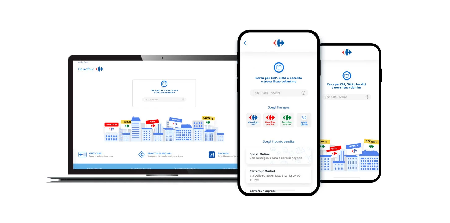
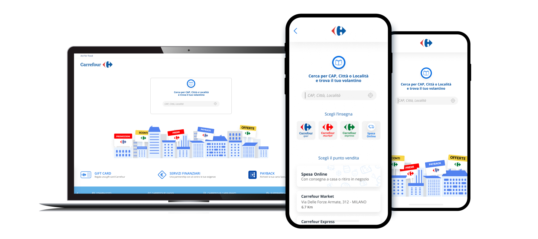
Once the users have chosen to know more about in-store promotions, they land on a page that lets them geocalize thorough a search bar. They’re then given the possibility to narrow their search by selecting a type of store.
Brochures
Pain Point: cover visualization
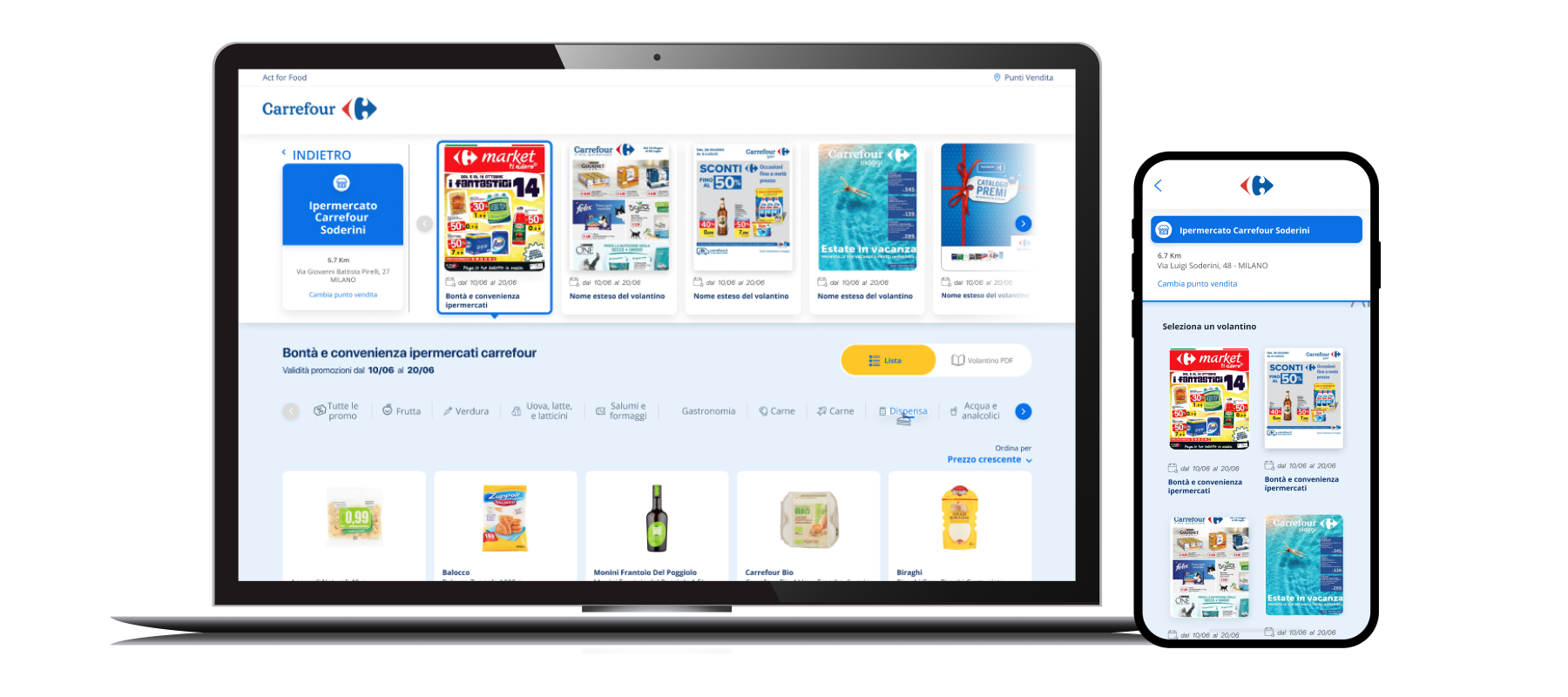
One of the requests from the marketing department was to make it possible for users to not only scan through all available brochures by viewing each of their cover pages, but to also have them constantly visible throughout the experience.
This required a compromise to be reached because while on desktop we had the space to fit on top of the page a carousel to scroll through, on mobile we couldn’t possibly fit all covers and products without requesting from the user a significant scroll effort.
Solution: dedicated page
We decided to add a passage on the mobile UJ by designing a page dedicated only to the task of choosing brochure by displaying their covers.
A semi-new identity
UI card focus
Promo Labeling
Pain Point: too much information
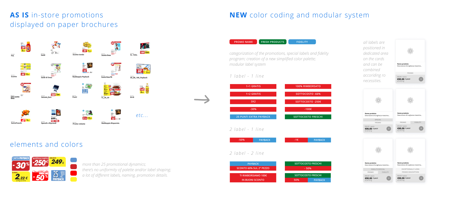
Carrefour is an international reality and has to adjust its offers to a wide variety of consumers by creating diversified discounts and offers.
Solution: modular system
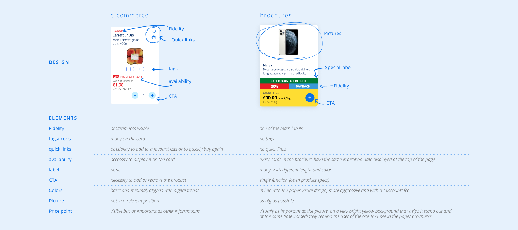
I created a modular card that could adapt to different promotional requirements: going from very little information (es. no brand name, short product descriptions, just one price point and no additional info) to a huge amount of them (es. brand name, long product description, multiple labels, multiple prices and eventual stickers).
Card Layout
Pain Point: differentiate from e-commerce UI
The visual identity of the brochures cards had to be different from the e-commerce ones in order to avoid confusion between them since the offers displayed in the brochures are not purchasable online, and at the same time the UI had to recall the one used on paper.
Solution: Colors & Layout
I decided to go for an abundant use of colors on labels and price point. Even when prioritizing the promotional information and the prices I nonetheless decided to reserve the images a large portion of the cards in order for the users to identify at a glance the products they’re looking for.
Added Value
Useful features
Pain Point: Maintaining engagement
One of the many challenges this project presented was to add new and useful features to a section free of an actual conversion cta, since you can’t actually buy the products. The struggle was in creating and maintaining engagement with the customers and finding a way to make them come back.
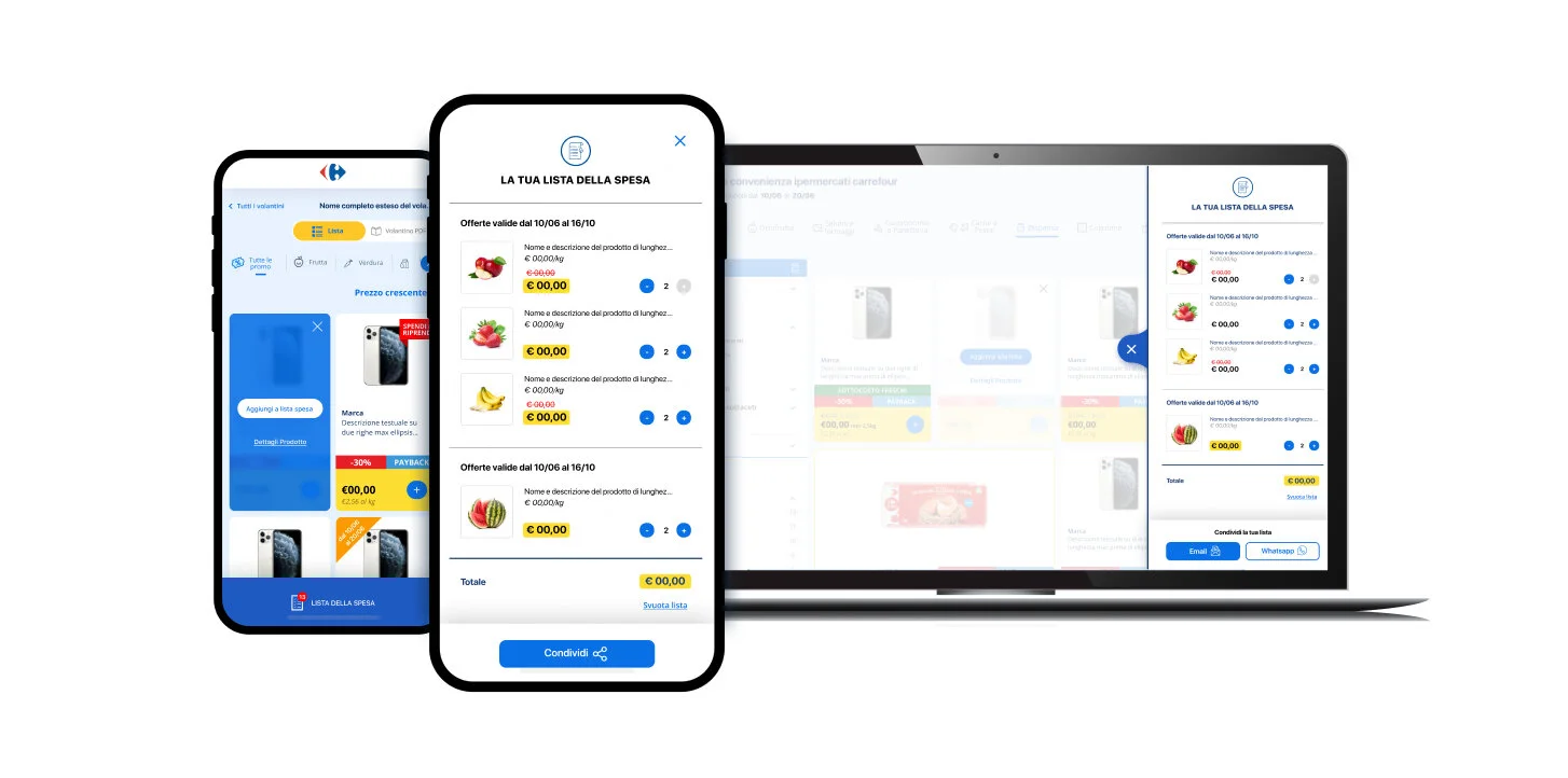
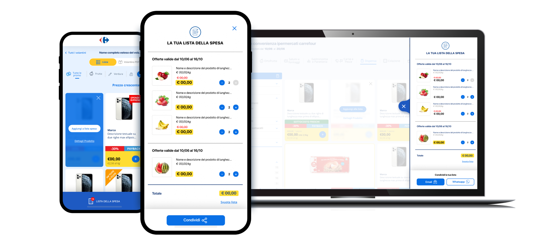
Solution: Sharable lists
We added the possibility of creating cross-brochures list, providing products’ specs and expiration dates (different brochures have different expiration dates for their promos), that enables the user to actually simulate a purchase. Once the list is created it’s then possible to save it for later - when the actual shopping is happening - or even to share it, via mail or the main chat apps.
Conclusions
The project has been complex and challenging, and had me delve into the world of large retail businesses in order to learn and understand their many rules and facets. The most demanding moments were those where confrontation with all the departments was necessary: in every big company there are always many stakeholders - and Carrefour is not exception - every one of which has its own priorities and targets. Being able to listen and understand everyone was the only way to actually find out how to prioritize and design not the solutions they wanted, but the ones they actually needed.
NB The project was launched in August 2020 and since then more fine-tuning work and implementations are being carried a daily base. That’s why some of the mock-ups on this page could appear slightly different from the online versions.
Would have been nice to… have had more time and resource to better understand our audience through interviews and live tests with the first demos and prototypes.
It has been nice to… work with brilliant and experienced colleagues, from whom I’ve learn a lot. Being open, constructively questioning processes and ideas, keeping up my research game made it possible for me to deliver the best work I could.

